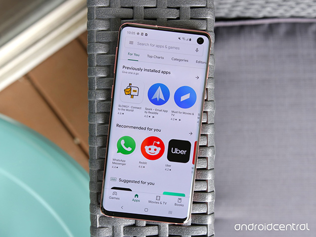
Google Play’s Material Design Theme is Live in the App Store
Have you noticed recent design tweaks to bread and butter Google sites such as Google Voice, Drive, and Gmail? These are just a few of several subtle but key changes coming to the look and feel of the internet giant’s design style.
Now live in the Google Play Store for Android users running version 15.1.24, the Material Theme means some key changes to the user interface. For instance, Google Music is no longer part of the main navigation (but can still be easily accessed from the menu). Green is out of the style guide – you won’t see any core design components in green. Buttons have more rounded corners, a refreshed font and lines and drop shadows are gone.
App pages have an optimized flow and hierarchy that positions app ratings right at the top, and an unmissable “install” call to action that spans the width of the page.
Overall, the experience is cleaner, more integrated and easier to use than ever. So why should you pay attention? Major players like Google form users’ habits and expectations around design, usability, and interaction. Staying up to speed on the latest content, design, and tech practices will be a boon to any business owner who has a marketing plan or digital design strategy. There is critical value in setting and updating a style guide – the latest from Google and others should be used as input to keep your look fresh and relevant.
Are you ready to establish content and visual style standards to make your business stand out? Make ASTRALCOM your partner in content marketing and full-service digital strategy. Reach out to learn more about our expertise.


